Get an overview of all graph settings available on the platform and how they impact the visualisation in your dashboard
This article applies to Trend Monitor
To be able to set and edit graph settings the following must be in place:
- Access to your dashboard
- Editor or Admin access to dashboard
Graph Settings refer to settings possible to do in a graph. These are settings that affect the visualisations of your graph. There are eight main groups of graph settings;
Below you will find a list of all settings possible in the above main groups:
1. Content
Content refers to the main chart and settings regarding this. There are six different settings in this group. Below you can see the meaning and implication of these.
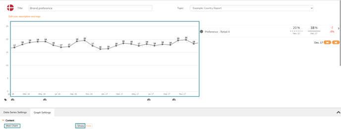
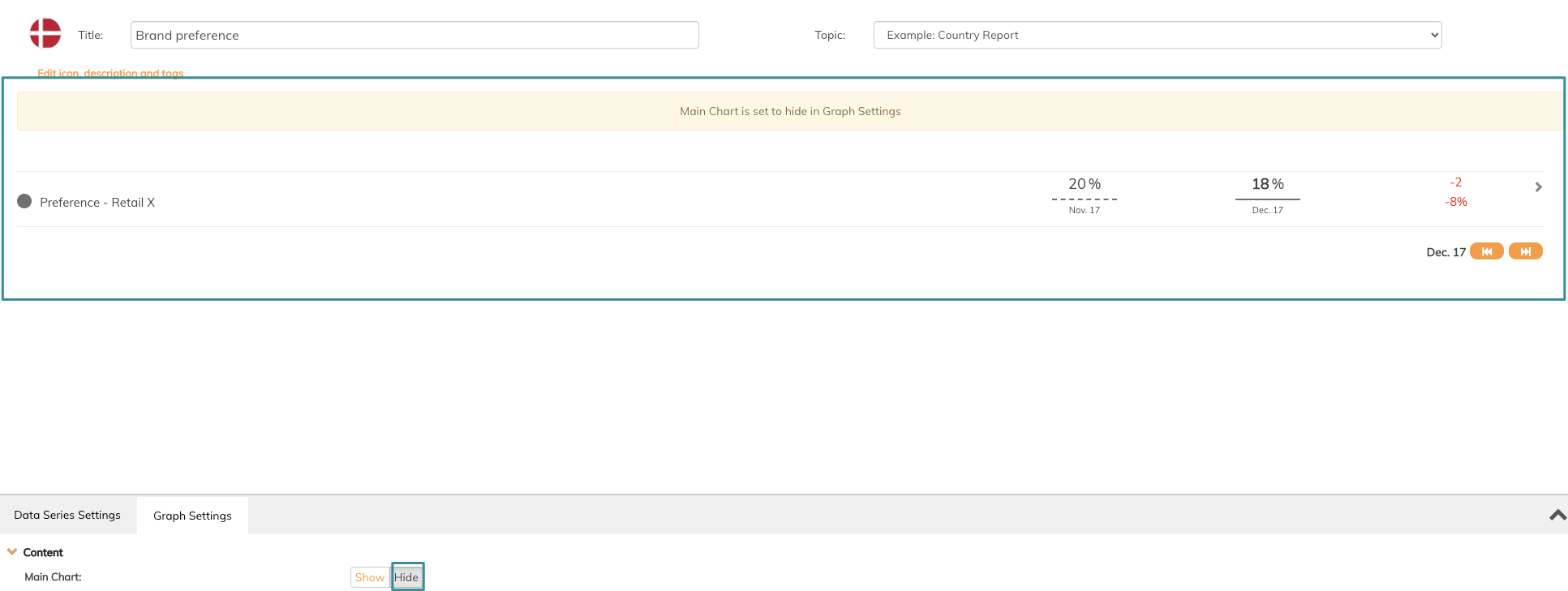
- Main Chart refers to the graph and this cant either be visible or not. See the difference in images below
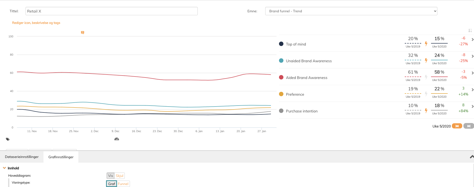
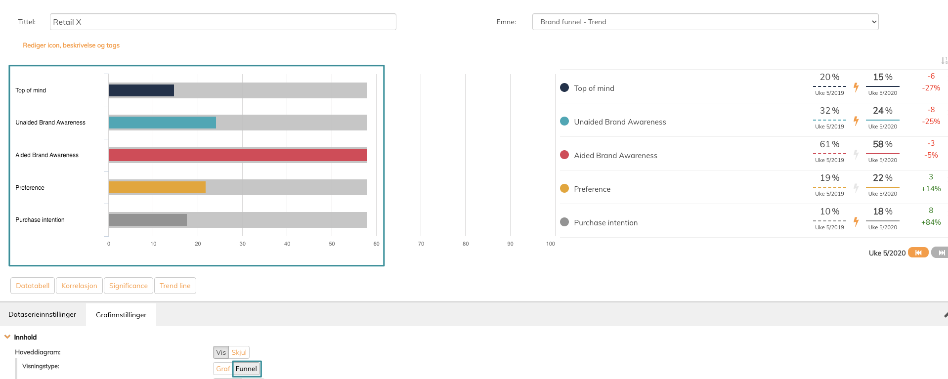
- View Type. Penetrace offers two types of view. Graph or funnel. See the difference in the images below.
- Chart Type refers to the type of graph you visualize your data series. The following graph types are available in Penetrace platform.
- Trend
- Pie
- Bubble (Beta)
- Bars
- Stacked bars
- Columns
- Stacked Columns
- Heatmap
- Spider
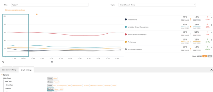
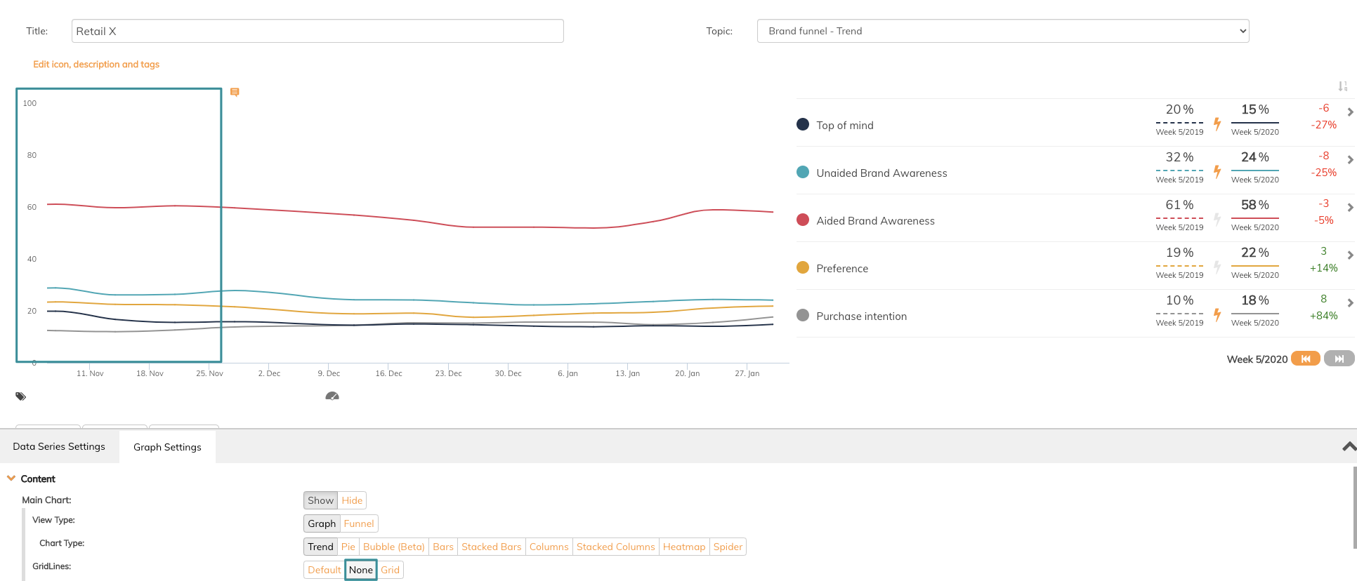
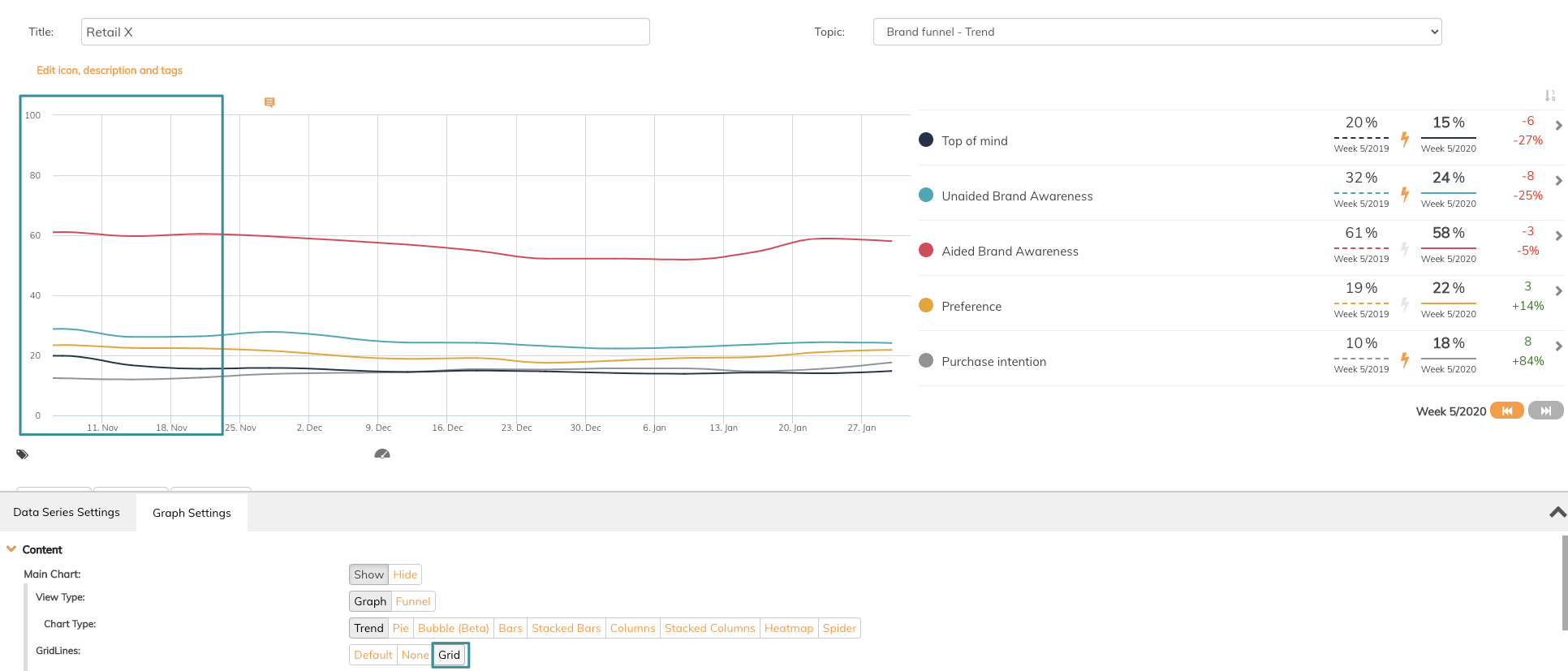
- GridLines refers to grid lines inside the graph. There are three different grid lines to choose between, default, none or grid. See the difference in images below
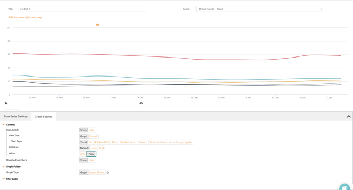
- Width refers to the amount of space the graph and legend takes. There are two possibilities available, either 100% or 50%. The width is default set to 100%. See the difference in images below.
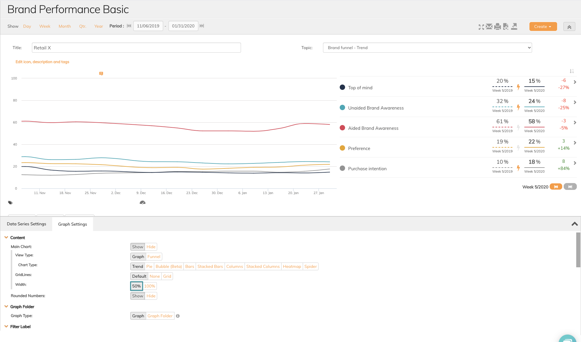
- Rounded Numbers refers to showing numbers with or without decimals. The default setting is Show rounded numbers and no decimals. If you want to display numbers with decimals click Hide rounded numbers.
2. Graph folder
Graph folder offers a possibility to add subgraphs to a specific graph. Graph folder is a smart way to save space in your dashboard. Press Graph folder to add already created graphs in your topic as subgraphs to the graph you edit. See images below.
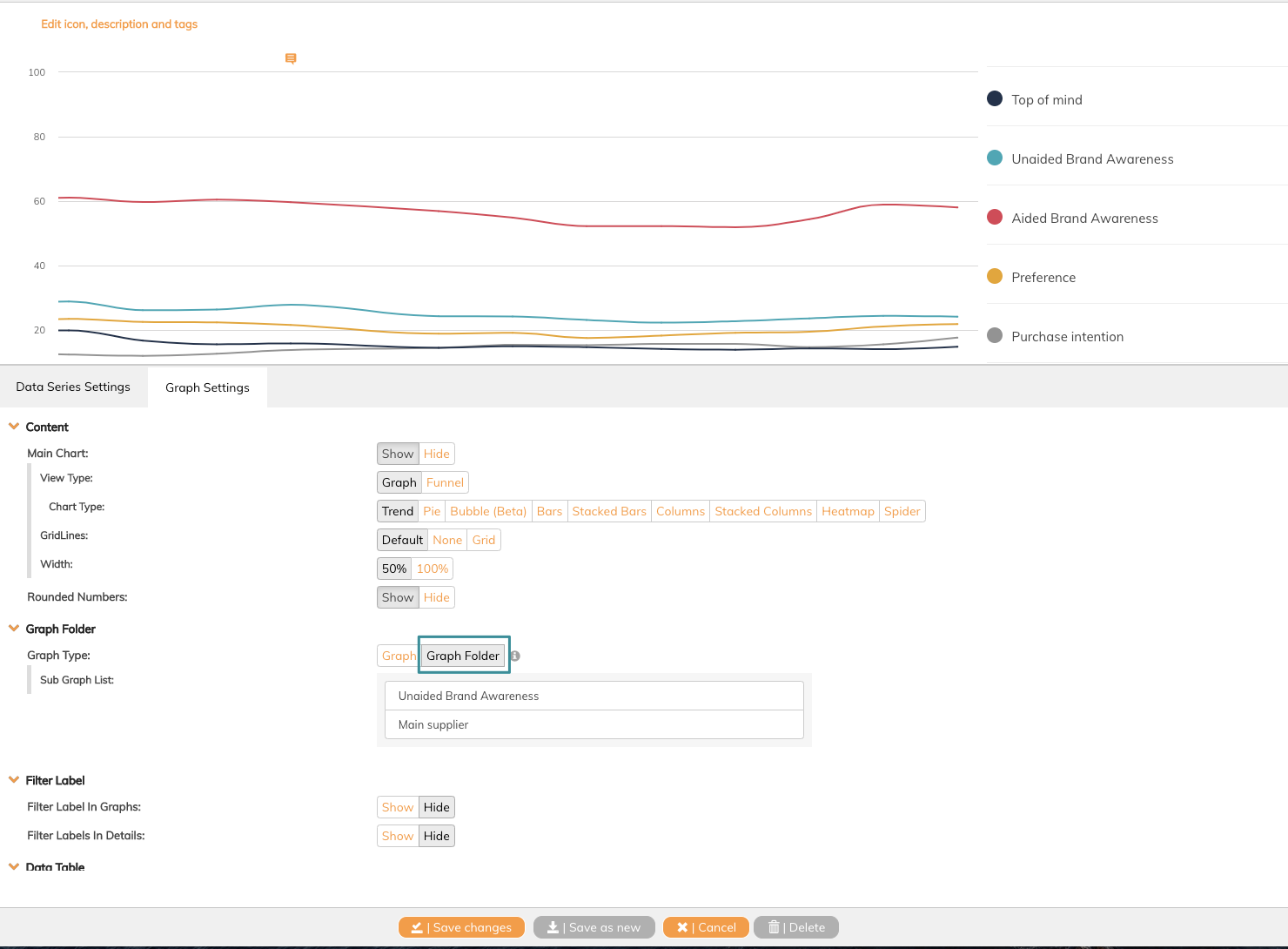
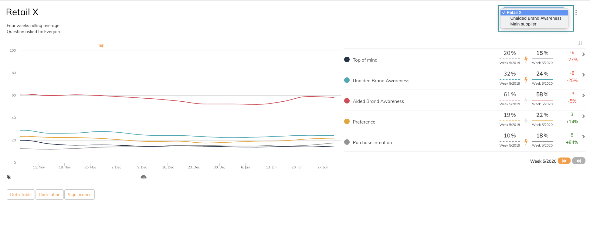
Add subgraphs
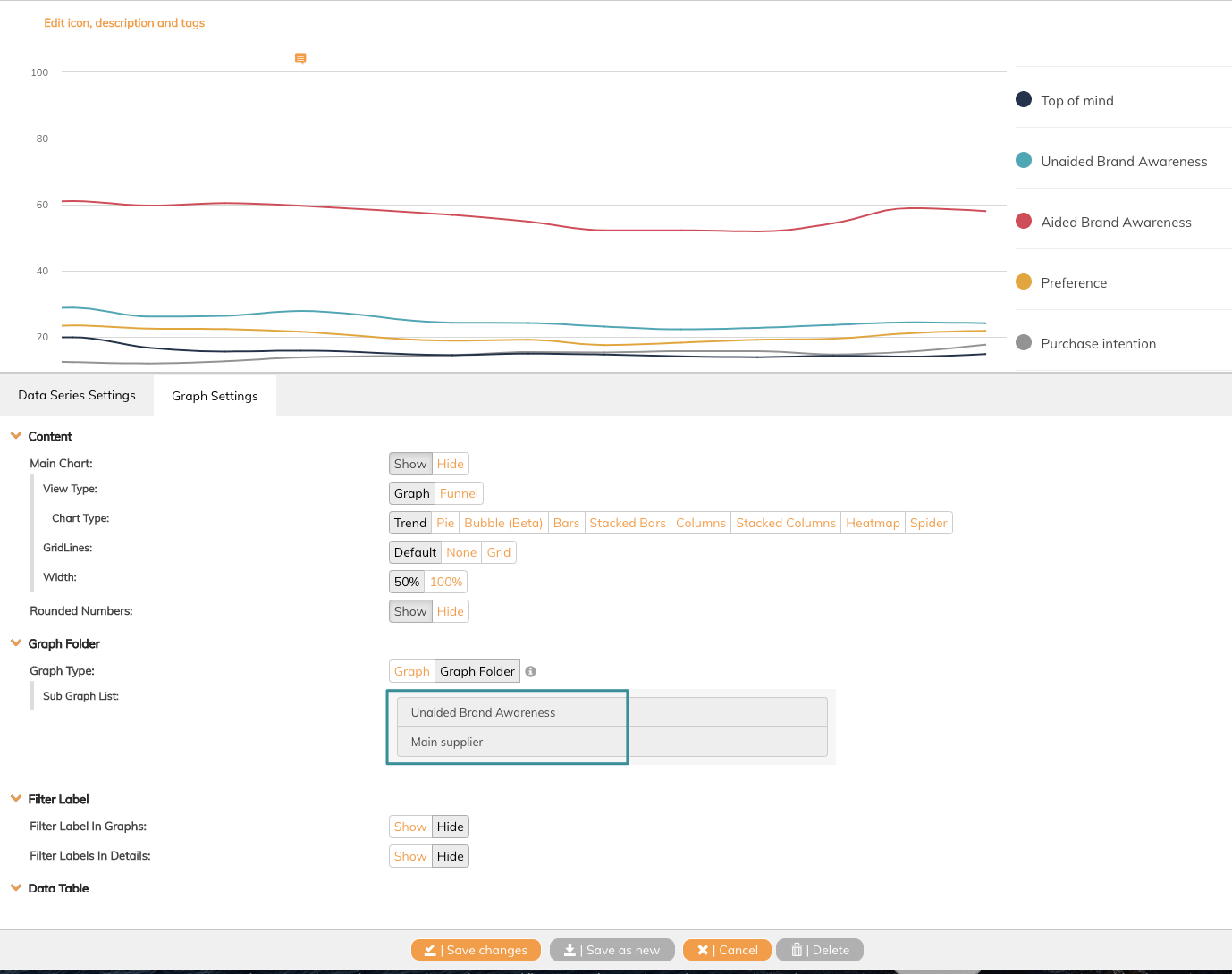
The subgraphs are now avaiable in a dropdown menu, and you can easily change between them.
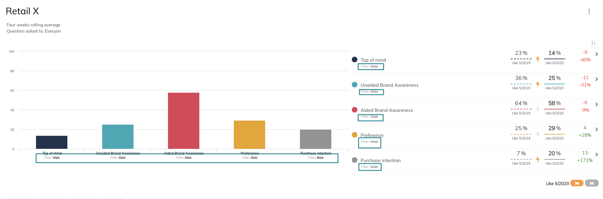
3. Filter Label
Refers to a function that allows you to show or hide filter in graph or legend. This function can be used in graphs that have filtered data series. Your can choose to show or hide both in legend and graph. See image below.
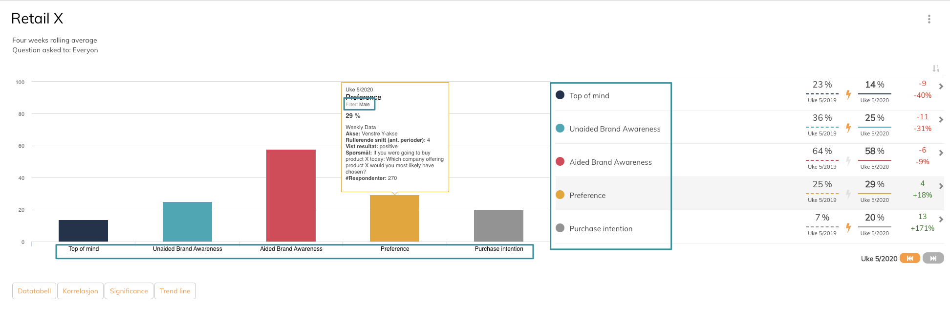
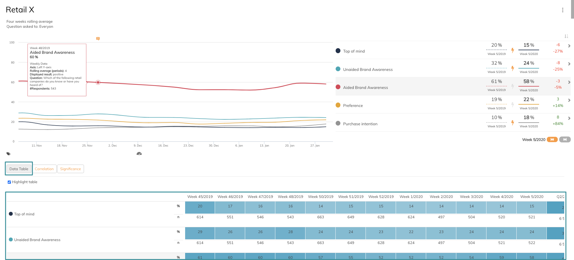
4. Data Table
Data Table refers to a function that allows you to compare more than one period. You can choose to show or hide the data table. If you choose to show data table a Data Table button appears in the graph and to see the table you need to click Data Table button in the graph. Be aware that you need to enable data table in data series settings.
5. Legend
Legend refers to the overview of the data series added to the specific graph. There are several settings available her
- Show Legend is the main setting. You can either show or hide Legend
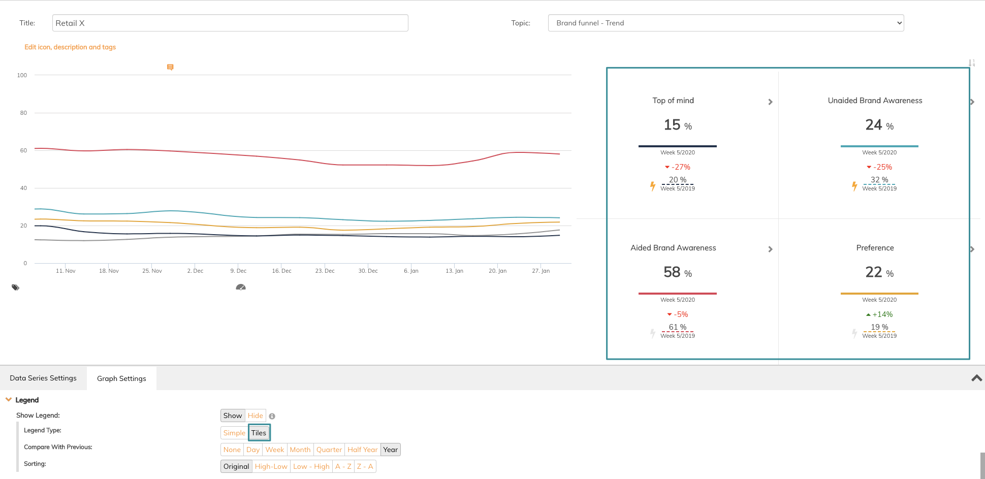
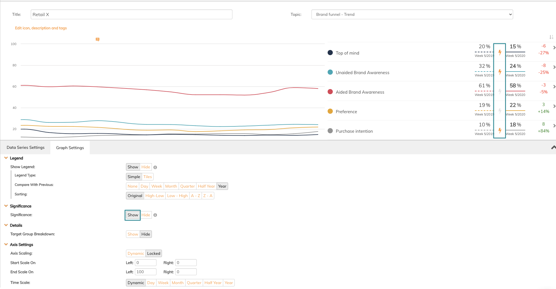
- Legend Type refers to the type of visualisation you want your legend to have. There are two ways to visualise, simple and tiles. See the difference in images below.
Simple:
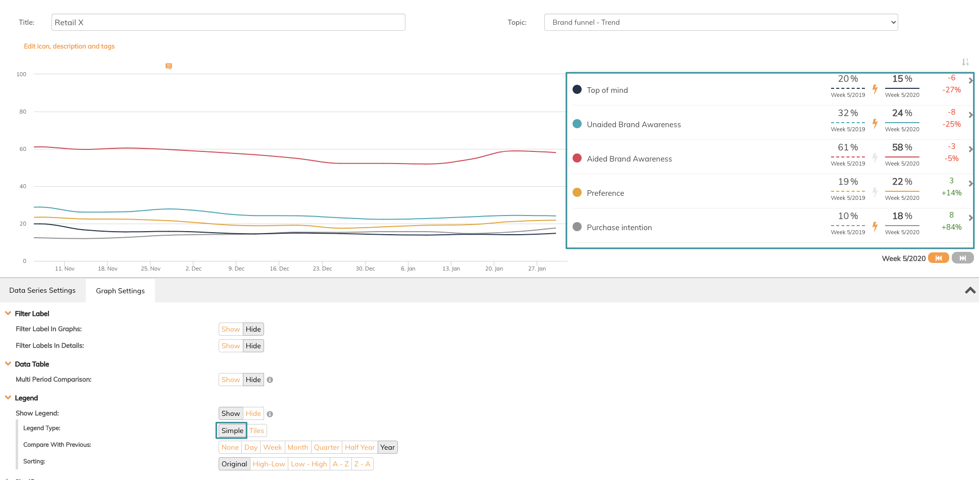
Tiles:
- Compare With Previous refers to which basis of comparison you want to set in your graph. You can choose between none, day, week, month, quarter, half-year or year
- Sorting refers to in what order you want to display your data series added. In some case, it is appropriate to display the data series in descending order and in other cases not. You can choose between original, high-low, low- high, a-z or z-a
7. Details
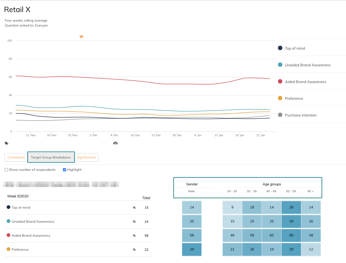
Details refer to a graph setting that allows you to see the data series broken down to different target groups. To be able to use this function, filters need to be enabled in the topic and you also need to choose the wanted filters in which you want to break down the data series.
Click Show and choose filters. When you exit the edit mode of the graph a button Target Group Breakdown will appear below the graph. Click this button and you will get a very useful overview of how the data series is distributed in the chosen filters.
Axis settings refer to a function that allows you to adjust the axis of the graph.
- Axis Scaling refers to the scale of the x-axis. This can either be dynamic or locked. If the setting is dynamic the axis will adjust to the data series value. If you choose locked, you can for instance set the x-axis to 100%. This is a good function if you want to easily compare levels in different graphs.
- Start/End scale on refers to a function that allows you to choose the scale of x-axis if you need to display the data series in another way than default way.
- Time Scale refers to the y-axis and this function allows you to set the time interval. You can choose between dynamic, day, week, month, quarter, half-year and year.
If you have any questions, do not hesitate to contact us on support@penetrace.com