Before you can read a report, you need the following:
- Access to dashboard
- Access to a report generated from dashboard
This is how you read a report from Penetrace:
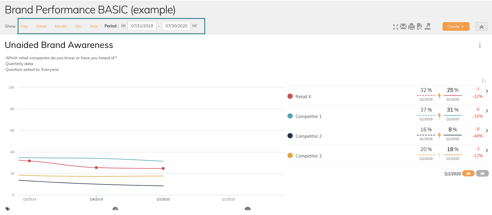
1. Make sure you have the correct Time period settings
In this area, you can change and filter results in a different time period. Simply click on one of the default time periods (day, week, month, quarter, year) or set custom time period in the date fields. Be aware that the dashboard settings will be reset when you switch to another graph.
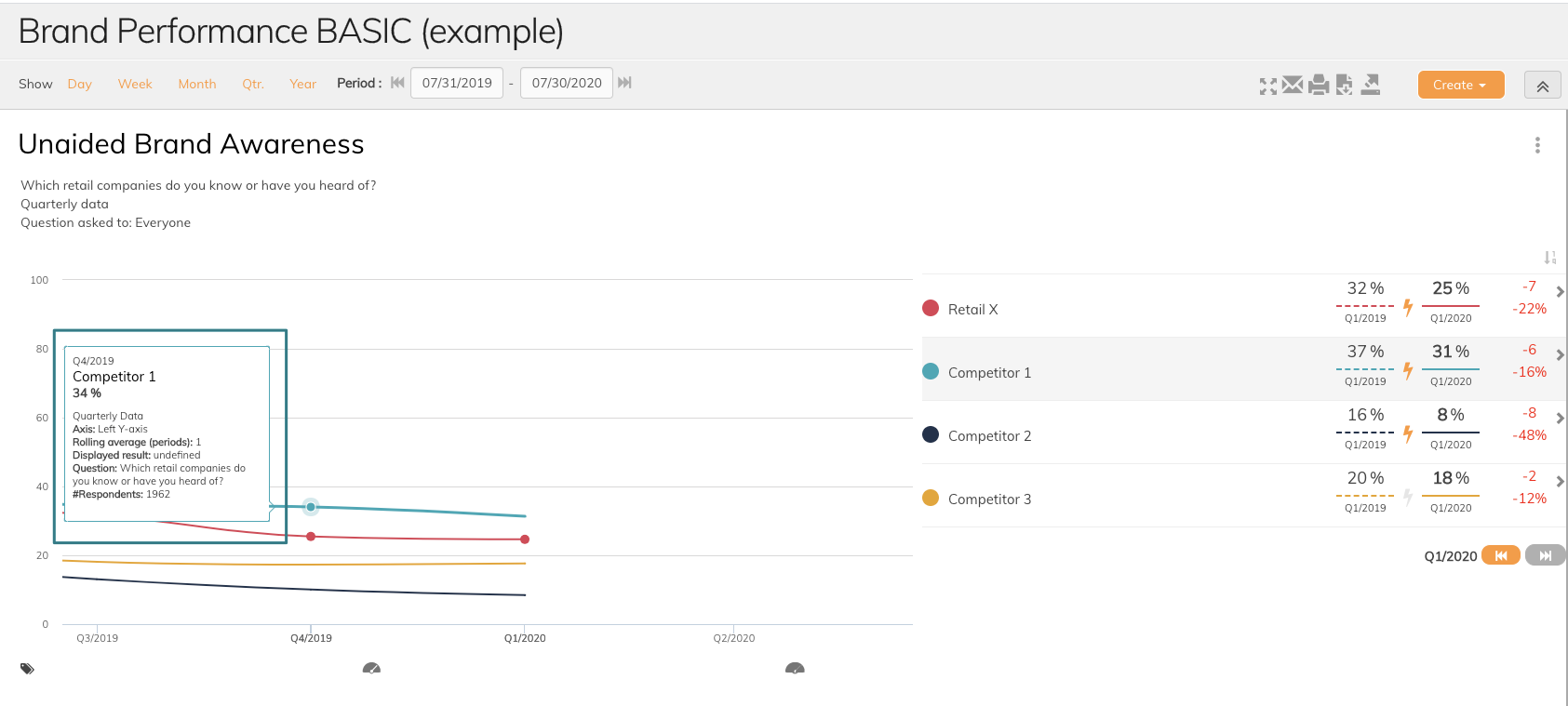
2. Detailed data information
If you need more details on data series hover over to see data series settings. This will give you an overview of aggregation, rolling average, question text and other important details. This is also a way to check if the data series added have the correct setup.
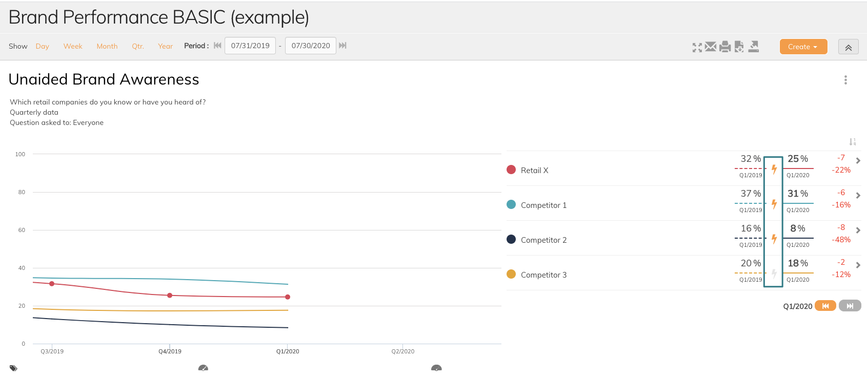
3. Significant changes
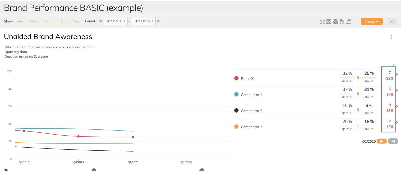
If the significance is set in graph settings, you are able to see data series that changes significantly from one period to another. If the significance icon (the lightning) turns yellow, this indicates a significant change. If the significance icon is grey, there is no change in data series to give attention to.
4. Comparison with last period
In graph settings, you can set comparison with earlier data. This can be set to yearly, quarterly, monthly or weekly whatever is best for you. The period is set in graph settings.
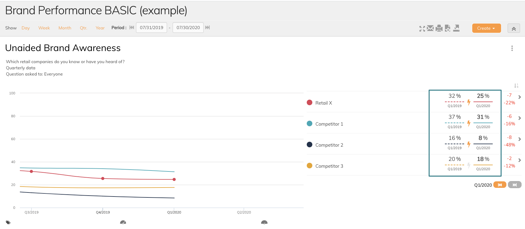
5. Percentage vs. %-point
Penetrace shows both changes in percentage and %-point. In the example below, we see that the unaided brand awareness for Retail X has decreased by 7 %-points in the last period, but the decrease in percentage is 22%. Remember to use your data correctly.
If you have any questions, do not hesitate to contact us on support@penetrace.com