You need access to your dashboard
A graph has to be created
Below you find an overview of the different icons in a dashboard/graph:
1. Graph folder

If you see this icon in a dashboard it indicates that there is a graph in a subfolder to the specific graph. This is often used to show the data series in a specific target group and to save space in the dashboard. In the image below you can see the icon in use in a dashboard.

When you click on the graph in a dashboard, a dropdown menu will appear and you can easily navigate between the graphs in the subfolder.
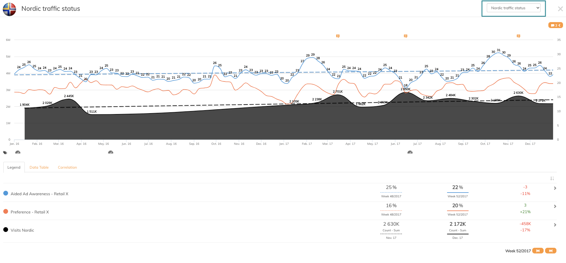
2. Comments

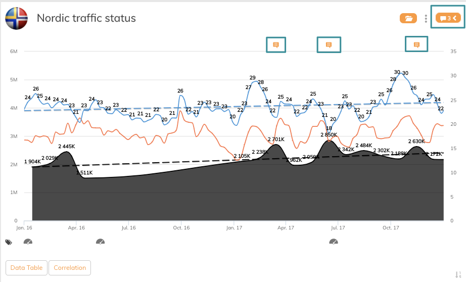
The Comments function is a very good collaboration function among the team that have access to the dashboard, and also to document events to explain changes in data series. Read more about how you comment on graphs here
3. Navigation between periods
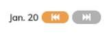
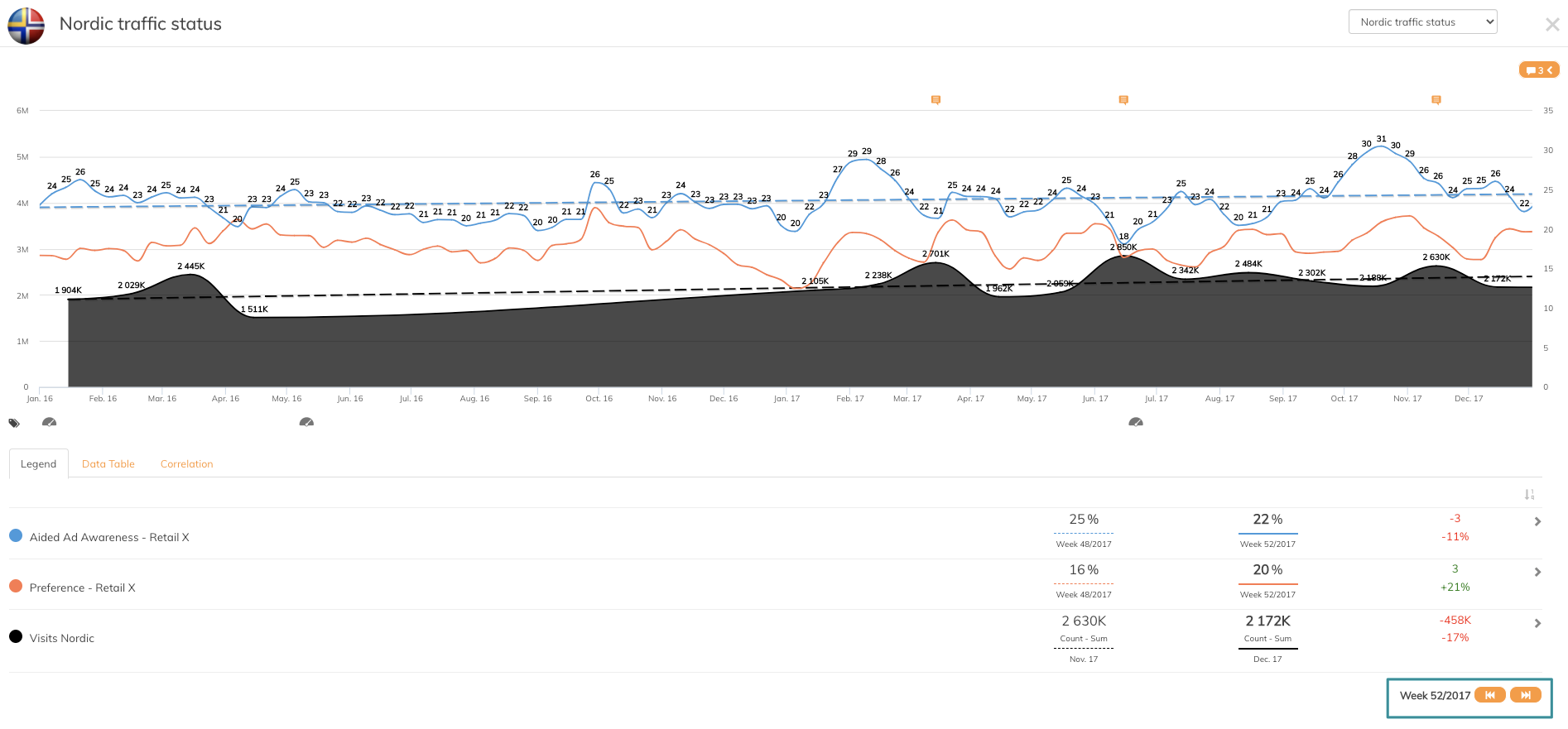
In every graph, it is possible to navigate between time periods. If the graph is reported on a weekly basis, as in the example above, you can click on the arrow and move between the weeks. The period is set in graph settings.
4. Penetrace icon

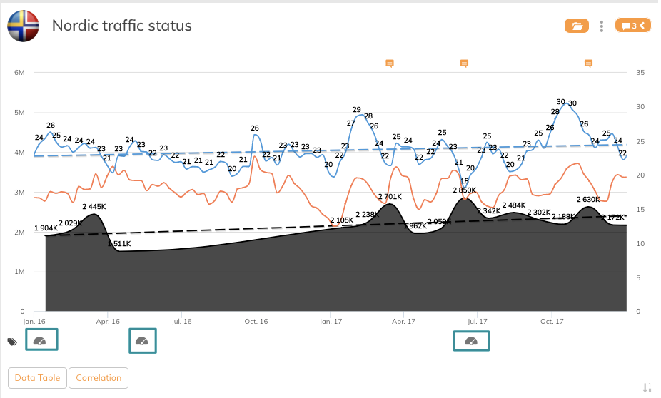
Whenever you see the Penetrace icon under the x-axis of a graph, you can see information about registered campaigns in the Campaign Library. This is a smart function to see information about campaign initiatives done in the specific time of period.
If you have any questions, do not hesitate to contact us on support@penetrace.com