Get an overview of all data series settings available on the platform and how they impact the visualisation in your dashboard
This article applies to Trend Monitor
To be able to set and edit data series settings the following must be in place:
- Access to your dashboard
- Editor or Admin access rights
- Chosen data series to do the settings
Data series settings refer to settings possible to do on the data series added to a graph. These are settings that affect the visualisations of your graph. There are three main groups of data series settings;
- Data
- Content
- Axis
Below you will find a list of all settings possible in the above main groups:
1. Data
Data refers to settings on the data series added to the graph.
-
Data Level refers to the aggregation level to which you want to view the data series. It is possible to choose between daily, weekly, monthly, quarterly, half-yearly and yearly aggregation level. Be aware of that aggregation level needs to follow the data basis
- Rolling average refers to the rolling level in which you want to view that data series. This should be used if the number of observations is lower than needed to decide on. For example, by selecting a rolling average of 4 you will include data from the previous 4 data points in the following data point. Smart to use to smooth out short-term fluctuations and highlight longer-term trends or cycles. If you don't want to use rolling averages, set the configuration to "1".
- Weighted refers to a function that allows you to weight the numbers in your data series. You can choose between On or Off. Be aware that the tracker has to have a weighting variable. Using this functionality on a tracker that does not include a weighting variable will have no effect.
2. Content
Content refers to the content in the graph.
- Main Chart refers to a function that allows you to remove the main chart. Default the main chart or graph is visible, but on some occasions, you may want to hide ut and only display the legend.
- Type refers to a function where you choose the visualisation of the data series. Depending on which graph settings you have chosen, different types are available
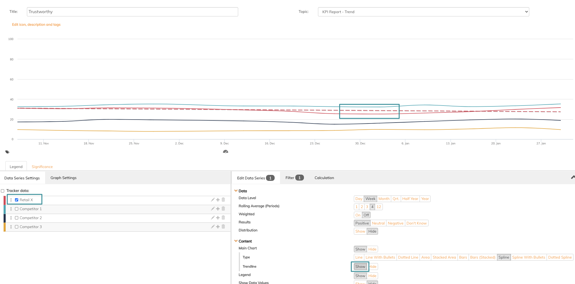
- Trendline refers to a function that allows you to add a trendline that shows the development of a specific data series. See image below showing an added trendline to one of the data series in the graph.
- Legend refers to a function that allows you to show or hide this in the graph.
- Show data values refer to a function that allows you to add information to the data series, such as value and unit
- Show data table refers to a function that allows you to enable the data table in the graph. This button needs to be enabled if you want to add the graph setting for data table - read more about the data table in this article.
- Compare with past period refers to a function that allows you to show or hide the comparison with other periods set in graph settings. Read this if you want to know more about the comparison.
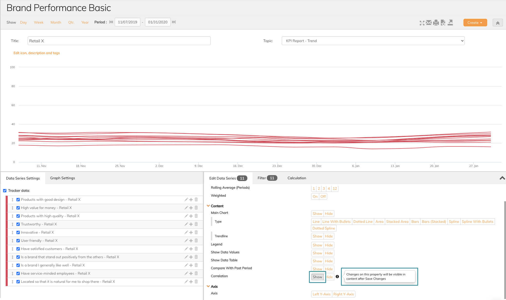
- Correlation refers to the function that allows you to see relations between data series. You can either Show or Hide this function. If you Show correlation, a button will appear in the graph after you have saved changes. See images below.
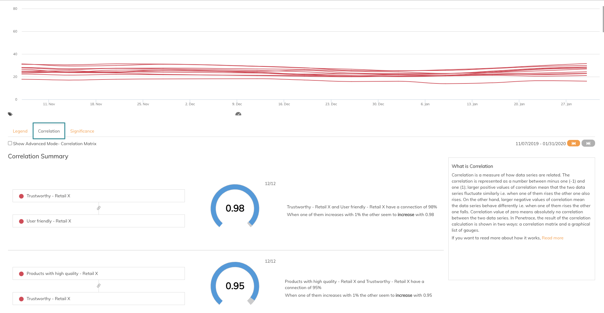
Read more about how you can use Correlations in this article
3. Axis
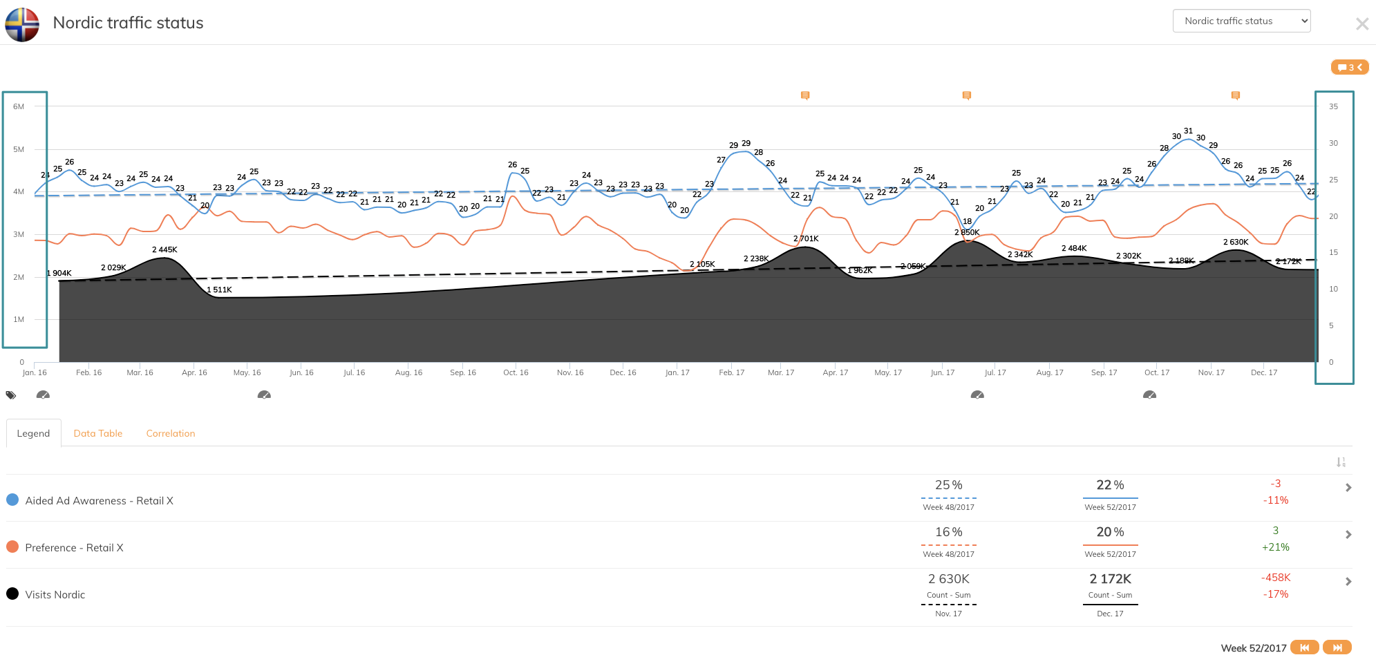
Axis refers to which one of the axis you want to place your data series. Some times it might be convenient to see data series on two different axes, especially if the data series have a widely different purpose or range. See image below for an example with a combination of web page visits and brand awareness. The nature of these data series makes it natural to place the two data series on different axes.
If you have any questions, do not hesitate to contact us on support@penetrace.com