If a graph should visualize data series with fundamentally different properties, it can be convenient to use some of the numerous Data Series Settings in the platform.
Before you can create graphs, the following must be in place:
- Access to your dashboard
- Editor or admin access rights
Take this graph as an example:
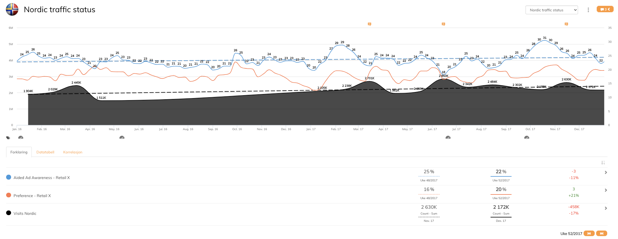
This graph includes data series that have a totally different data range and to be able to display the data series in the same graph, it is necessary to use advanced data series settings.
Below you will find tips and trick to create graphs like the example above:
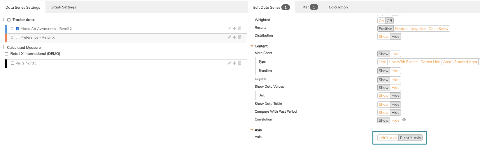
1. To place data series in different axis, use the Axis function in Data Series settings.
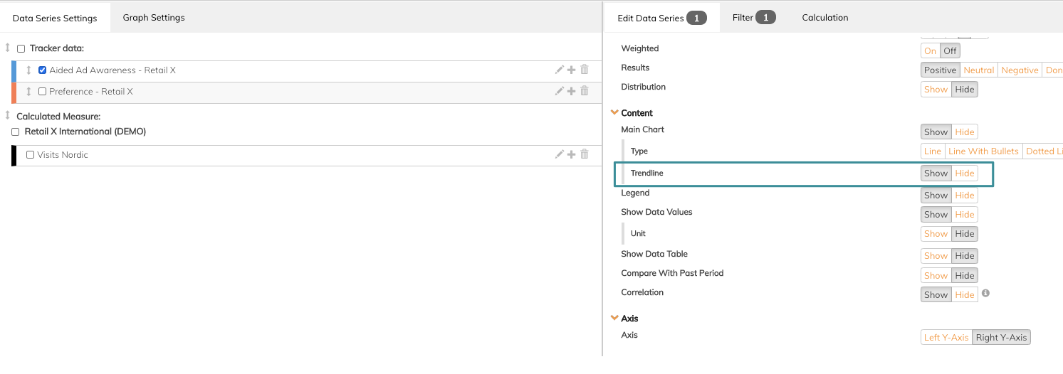
2. To show a trend line to an added data series, use the trendline function, in Data Series Settings.
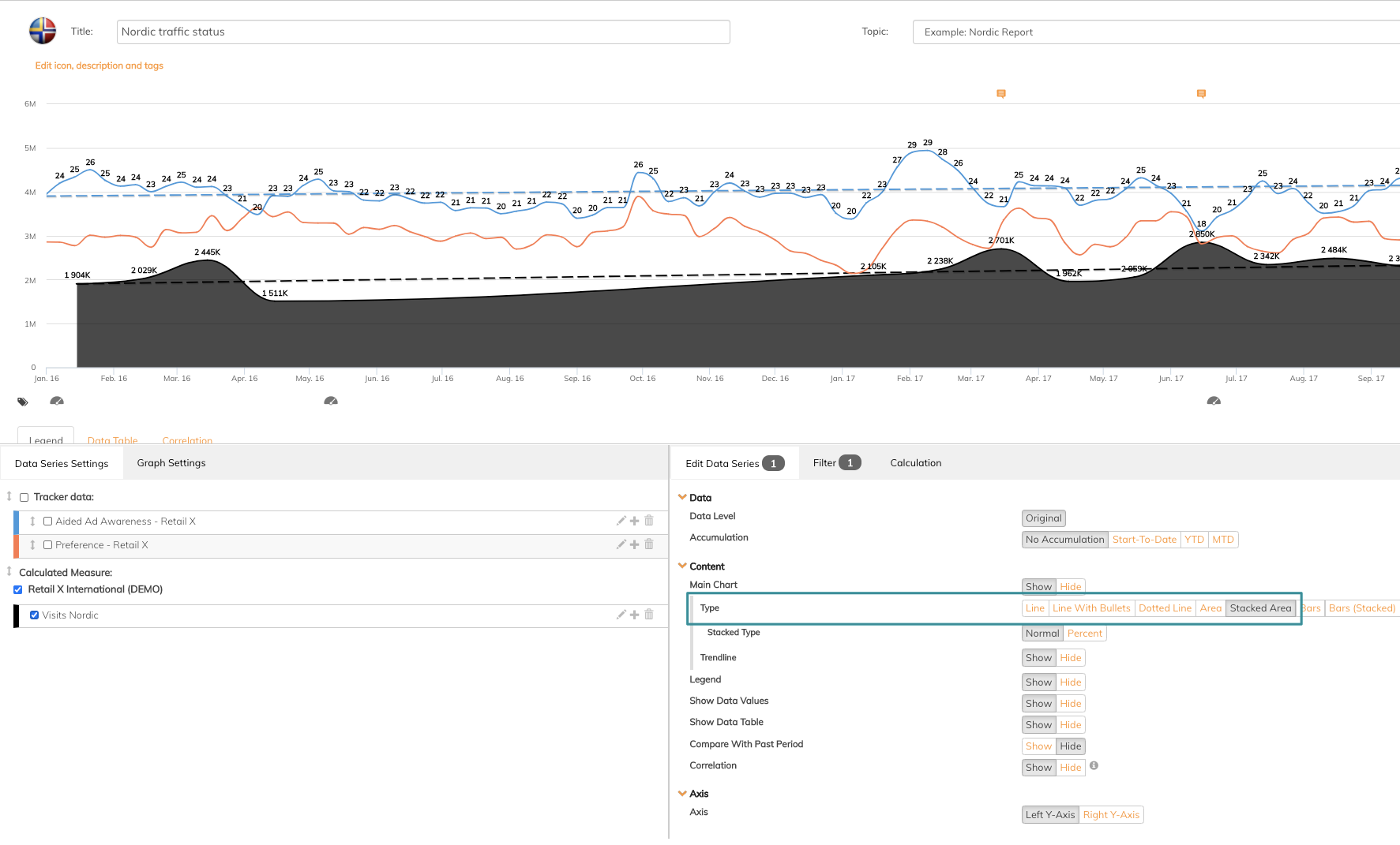
3. To visualize a data series as an area instead of a line, use the Stacked Area graph type in Data Series Settings.
Explore more data series settings in this article.
If you have any questions, do not hesitate to contact us on support@penetrace.com